Unifying pet commerce, services and rewards
Morshel sold pet products through one flow and booked grooming through another, two apps that happened to share a logo. I merged them into one architecture and pulled the rewards programme out of its own tab into the moments where people earn and spend.
What I can and can't claim here
I designed and delivered this. I did not get to measure it.
The engagement ended in January 2026, before the redesign had a full post-launch measurement window, and the team had no analytics instrumentation beyond basic funnel counts when I arrived. So the 62% abandonment baseline is real and pre-existing; the after-numbers are not mine to claim.
What I did instead was define what should be measured, and instrument the success criteria so the team could read the result without me. Those metrics are below. Where I have a number, it's sourced. Where I don't, I say so.
One note on wording: I was the only designer here, so every design decision below is mine and I write it as "I." The few places I write "we" mean the working group that had to agree on it: me, the two engineers and the founders.
The Problem
Most pet apps treat buying a bag of food and booking a groom as unrelated tasks. Morshel had built both, and users had to learn two different products to use one company.
Where it broke, specifically:
- Discovery: products and services used two separate navigation architectures. Users searching for grooming often ended up in the store.
- Booking: real-time slot availability sat behind a 4-step wizard, so users often abandoned before seeing open slots or upfront pricing.
- Rewards: points, tiers, coupons and referrals were all tucked away in an isolated wallet screen, instead of appearing at the moments people earn and spend them.
Get people to buy across both categories in one session, and put the rewards programme, which was sitting unused in a wallet tab, somewhere it could actually bring people back.
What the audit turned up
Three things came out of going through the existing app with the founders and the support log, and they all pointed the same way.
The booking flow lost people before it showed them anything worth staying for. Real-time availability and upfront price are the two facts that decide whether someone books a groom, and both sat behind a four-step wizard. The user was being asked to commit to a path before finding out whether the path was even open.
The rewards programme had the same problem in a different shape. Points, tier status and coupons all lived in their own tab, and as far as actual behaviour went, that meant they didn't exist: nobody navigates away from a booking or a payment screen to go and check whether they have something waiting. A balance you only see when you go looking for it isn't a loyalty programme, it's a line in a changelog.
The third one only became obvious once I started sketching live states. When your dog is at the groomer right now and you want to know whether it's finished, you want the system to be predictable, not interesting. Every bit of novelty I put into those screens was a cost, and that turned out to be the rule that killed my favourite idea on this project.
Success Metrics
- Increase combined cart checkout completion rate.
- Drive higher utilisation of the rewards programme (points redemption rate).
- Reduce customer support tickets related to order and appointment status confusion.
What I decided, and what it cost
I spent a week building a gamified 'pet avatar room': your pet's profile grew as you bought food and booked grooms. I liked it a great deal. In the review, the founder asked how many taps it now took to reorder dog food. Three. I killed the concept the next morning and went back to standard e-commerce patterns, which is a dull sentence to write and was the right call: this is a utility people open with a task already in mind, not somewhere they come to spend time.
The scope fight went the other way. Engineering wanted to ship grooming booking without live slot synchronisation to make the launch date, a version where you pick a time and find out afterwards whether it existed. Given what the audit had just told me about why people abandoned bookings, shipping that would have been shipping the original problem with new colours. I proposed a two-stage rollout instead, which kept real-time availability in scope rather than letting it become the thing quietly cut to save a date.
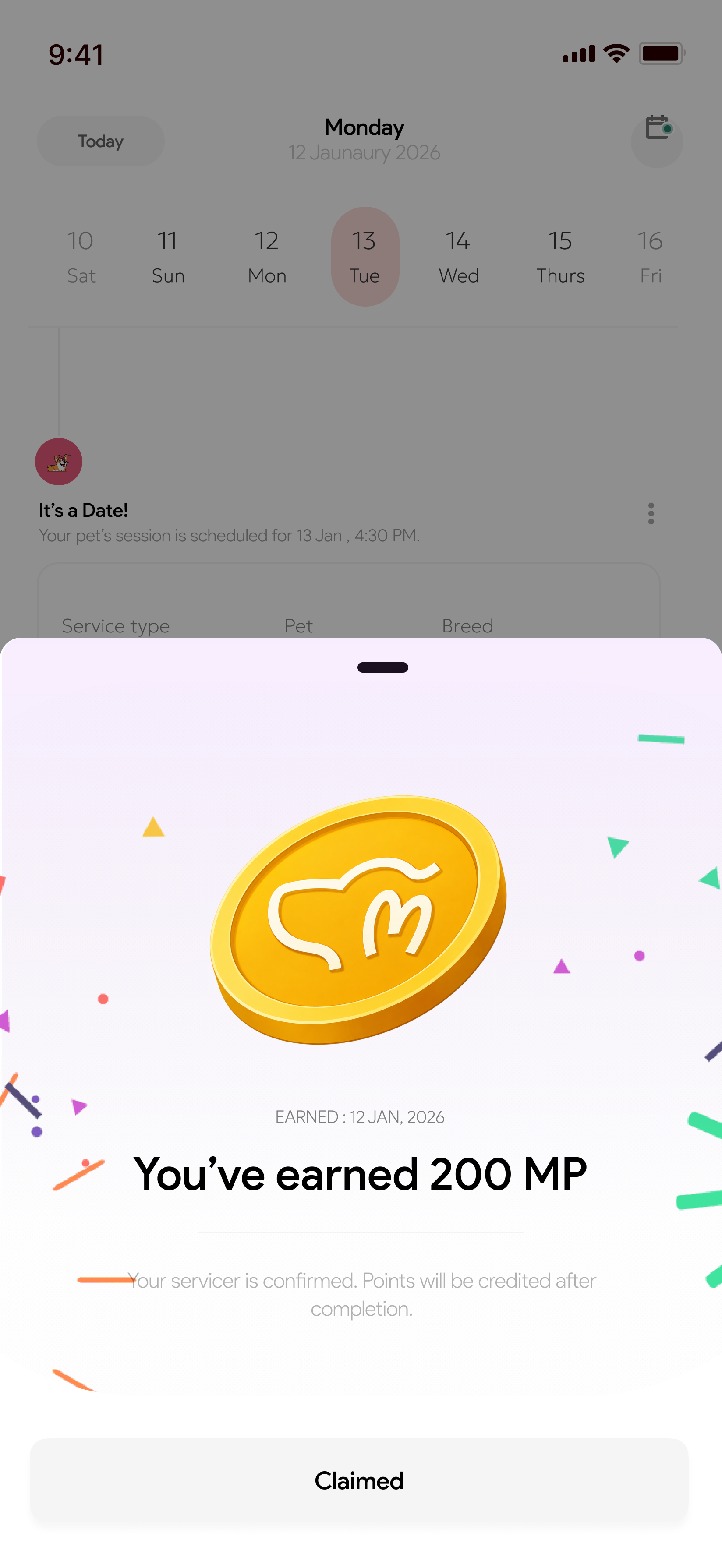
The one rule I refused to bend was that earning and spending points gets no detour. If applying a balance meant a trip to the wallet tab, most people were never going to bother, and the whole point of the engagement was to get that programme used. So the earn moment had to sit on the confirmation screen and the balance had to be applicable inside the payment step, or it may as well not have been built.
Ideation & Module Architecture
I focused on modular, system-first thinking before touching visual design. The product was broken into 9 core modules to manage complexity and keep commerce and service flows consistent.
Feature Deep Dive
Rewards, moved into the flow
Users were abandoning carts when they had to navigate off to a separate rewards section to find and claim their points.
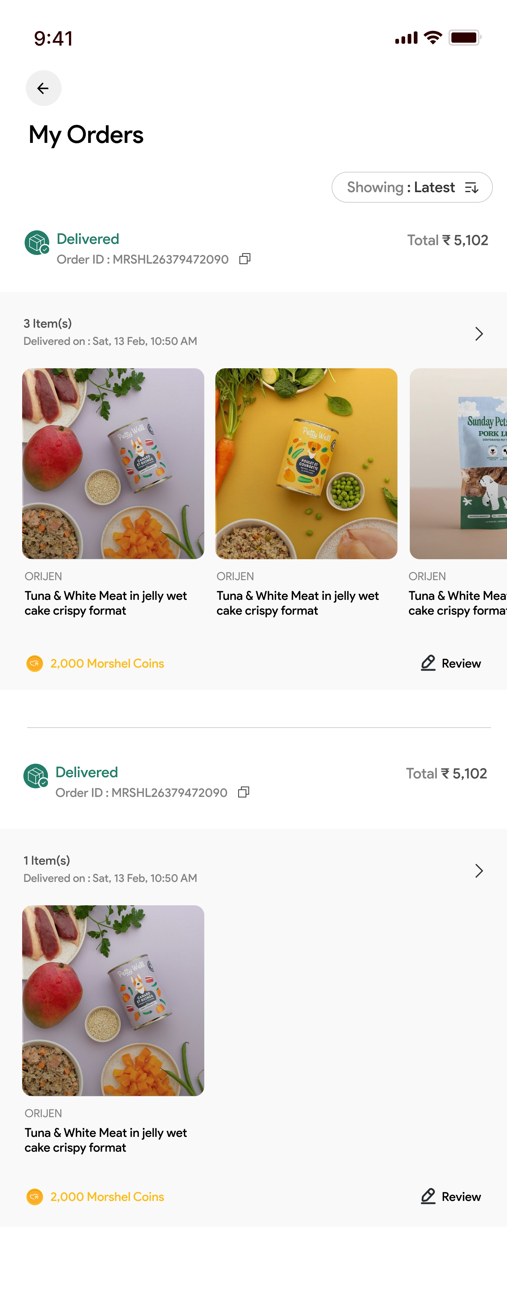
I stopped treating rewards as a destination. Points are earned on the booking confirmation itself, order history shows what each order returned in Morshel Coins, and the balance is applicable inside the payment step rather than behind a wallet tab. The wallet still exists; it just isn't the only place the programme is visible any more.
Designed to cut cart abandonment and raise redemption by surfacing the balance where the decision happens. Not verified: the engagement ended before there was instrumentation to read it against the 62% baseline.
Service & Grooming Appointments
Booking grooming services caused anxiety due to unclear pricing and unavailable time slots.
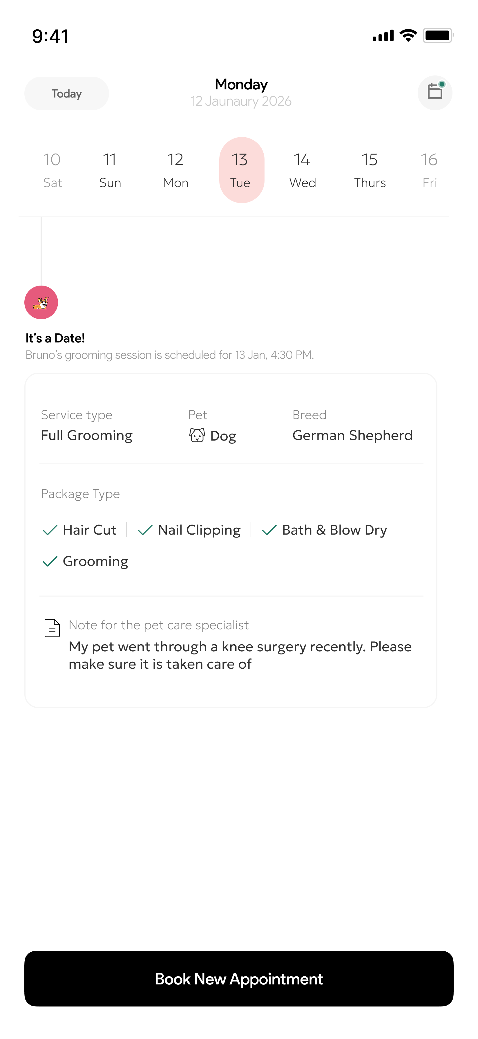
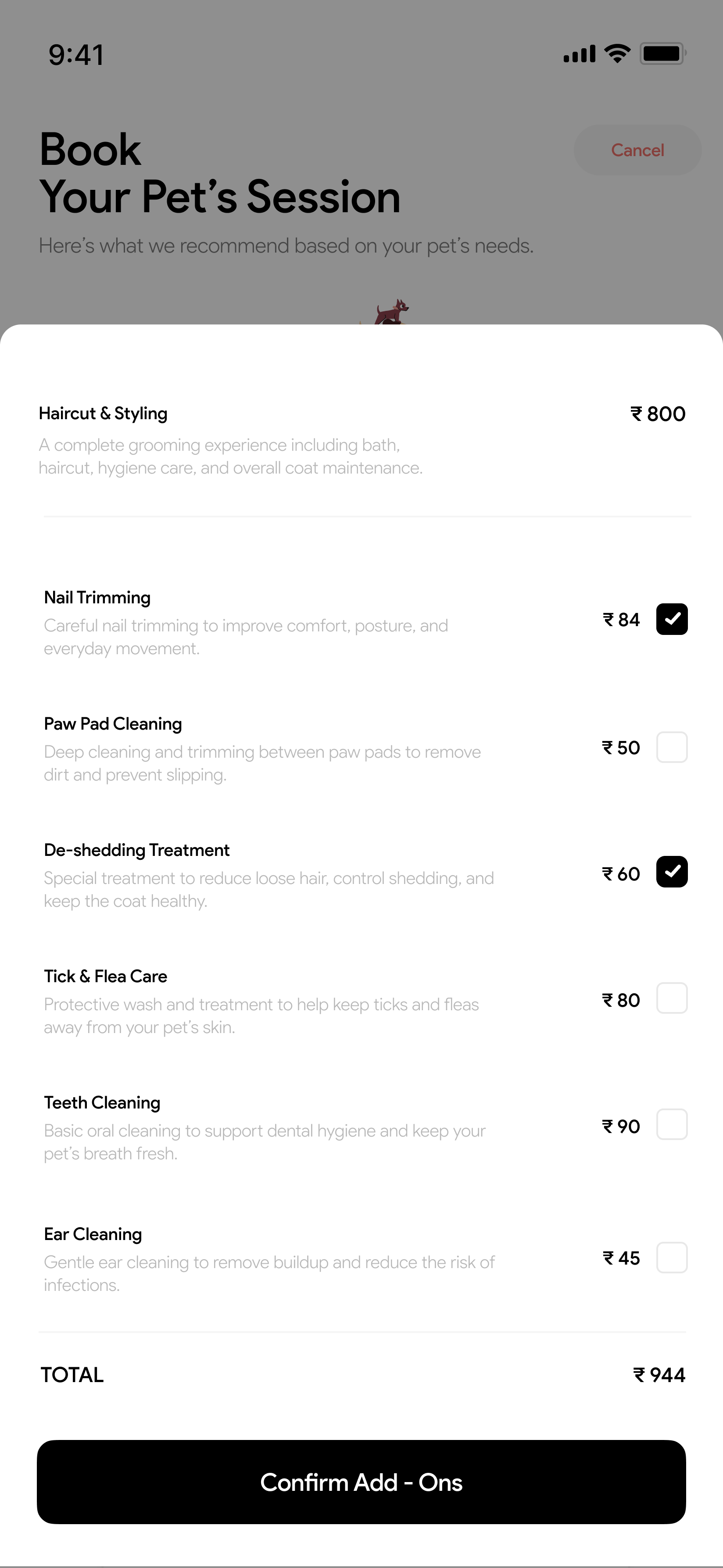
Replaced the four-step wizard with a dated agenda and a single booking sheet. The base service is priced before anything else is asked, each add-on carries its own price and a one-line explanation, and a running total sits above the confirm button, so the cost is known at every point rather than revealed at the end.
Final UI Gallery
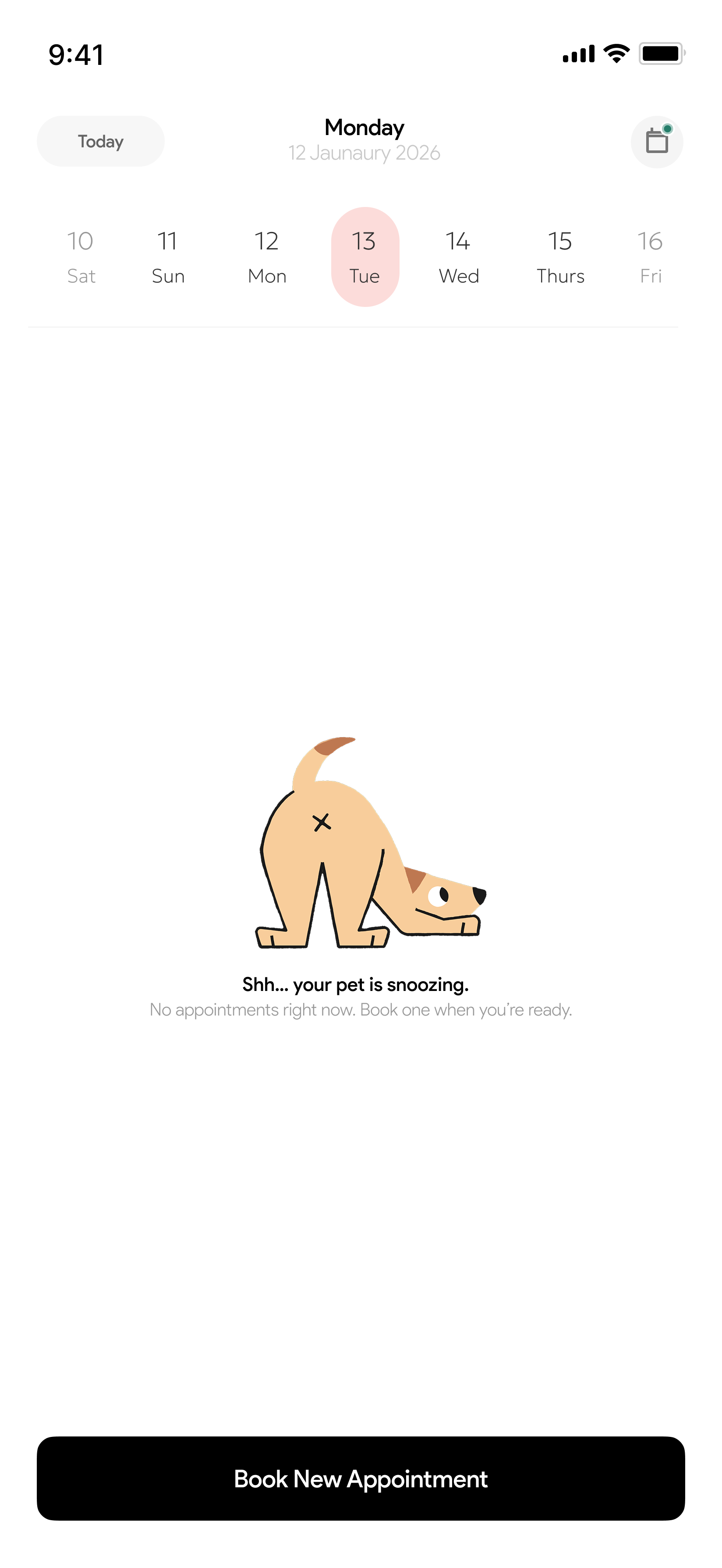
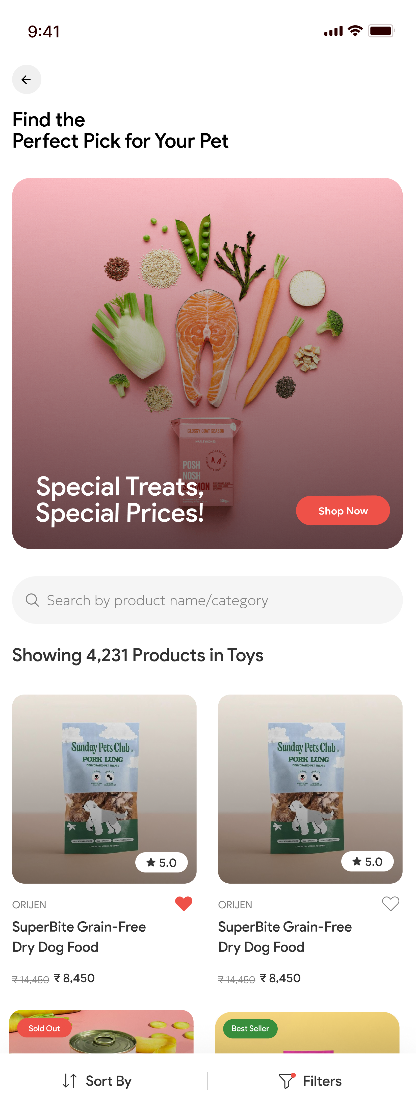
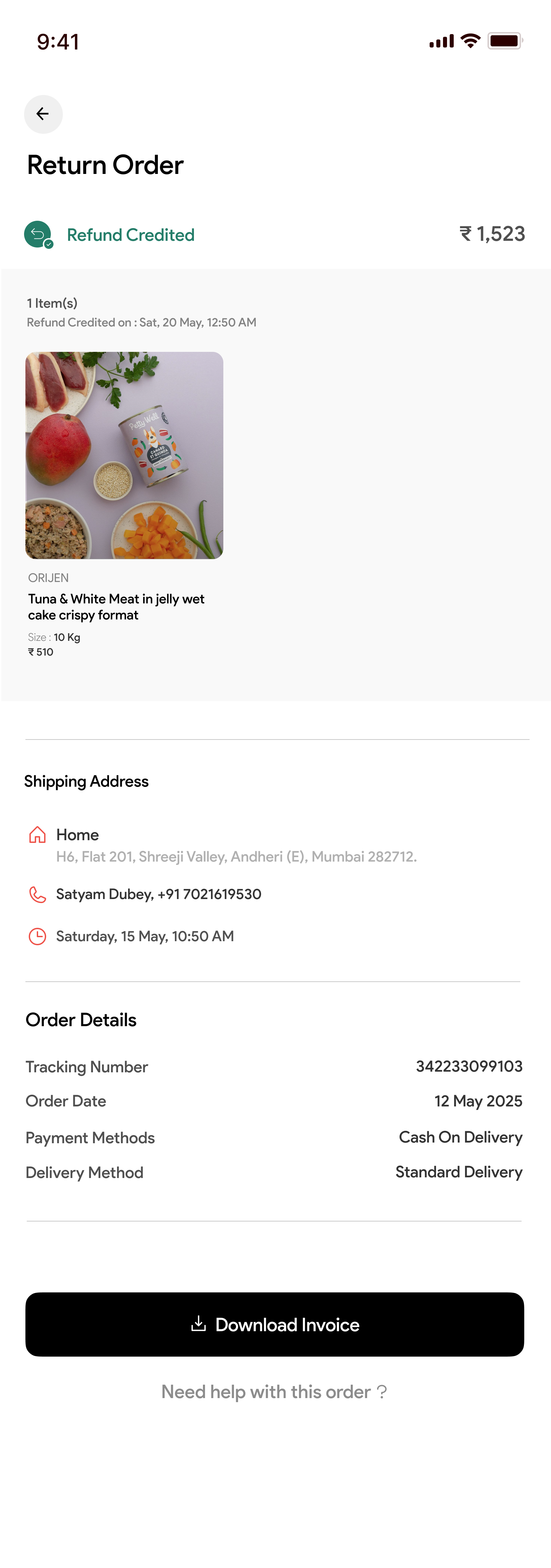
Thirteen screens across the four flows I owned: entry, service booking, rewards, and the commerce and post-order stack.
Two things I reference above aren't in these thirteen: the cart and payment step, and the live slot picker. Both were designed and handed over; they're just not in the export I kept, and I'd rather say that than let the gallery imply it covers everything.


Tradeoffs & Decisions
Structuring the Super App Home Screen
Pros: High engagement, discoverability of new products.
Cons: Terrible for utility. Users want to book a grooming slot fast, not scroll a feed.
Pros: Clear separation of intent (Shop vs Book) immediately upon open.
Cons: Requires an extra tap to get to specific content.
E-commerce users arrive with high intent. The goal isn't 'time in app', it's 'time to checkout'. I prioritised predictable navigation over endless discovery, and took the extra tap as the cost of it.
What Changed Because of This Design
Fragmented Apps
↓Hidden Rewards
↓High Cart Abandonment
Single Super App
↓Rewards surfaced in-flow
↓Orders and appointments each answered in their own place
Business Impact
Not measured: the team lacked analytics instrumentation post-launch. The target I agreed with the founders was to bring the 62% cart-abandonment baseline under 45% by making the points balance redeemable inside the payment step. Whether it got there is something I genuinely don't know.
Collaboration & Alignment
As a solo designer on this project, I owned the end-to-end design but I was never designing alone. I held bi-weekly alignment sessions with the founders to ensure the UX met their business goal of driving repeat purchase through the rewards programme. When developers pushed back on the complexity of applying a points balance at checkout, we negotiated a phased rollout: launch with manual redemption first, and save automated point application for v2.
Reflection
- What worked: Treating rewards as something that happens inside other flows rather than as a destination of its own. Earning shows up on the confirmation screen, and each order states what it returned: the programme is visible without anyone going to look for it.
- What I learned: Operational clarity matters more than visual delight. Clear system states reduce user anxiety, and designing for failure is critical in live, time-sensitive workflows like service bookings.
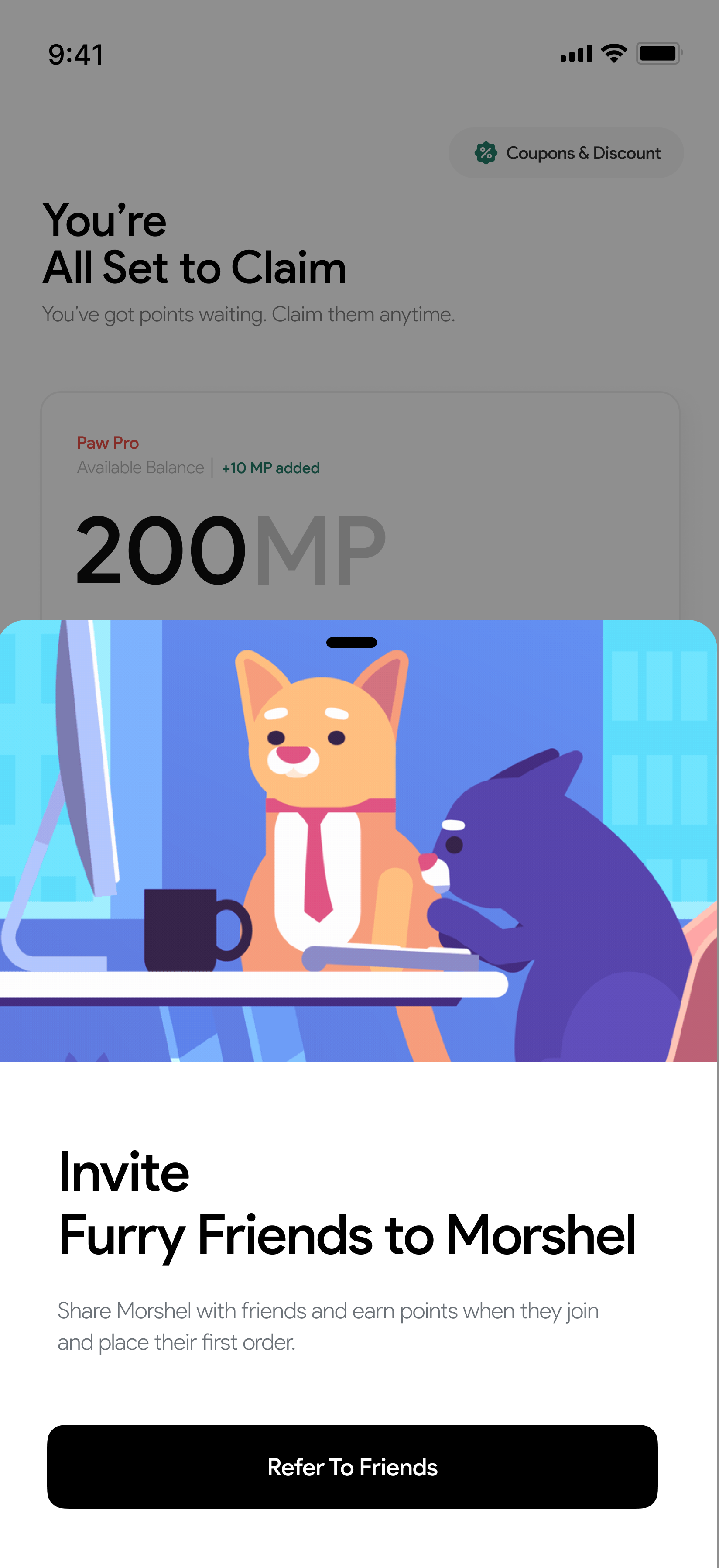
- What I'd fix: The reward currency is called MP on the balance screen and Morshel Coins in order history. I shipped both names because they came from different conversations at different times, and I didn't catch it until I laid the final screens out side by side. Two names for one currency is the kind of thing a shared glossary prevents, and I now write one before the second flow gets designed. The confirmation screen also reuses the empty-state illustration, which is the same failure of cross-flow review.
- Next Iteration: Usability testing with real pet owners. The flows above are argued from a support log and a founder audit, not from watching anyone use them, and that's the gap I'd close first. After that, instrumentation on the redemption funnel, so the next person to work on this has the numbers I didn't.